Transforming a Low-Conversion Hydrogen Bottle Listing into a High-Performing Amazon Brand Asset

How strategic visual storytelling transformed a low-performing listing into a high-converting brand asset. I’ve designed these specifically to be readable on a smartphone screen (where 70%+ of Amazon shopping happens).

Client Overview

Industry: 
Functional Health Technology & Premium Hydration.

Business Stage:
scaling brand

Primary Goal:

Target Persona:
High-performance athletes, biohackers, and health-conscious professionals aged 30–55.

The Problem: Identifying the Conversion Killers

Key Insight:
We identified that customers weren’t complaining about the price itself, but rather the lack of perceived value. By failing to visualize the ‘Hydrogen Science’ and the lifestyle ‘ROI,’ the listing was forcing customers to make a decision based on cost rather than health benefits.

Strategy & Approach

A. Conversion Research

  • Competitor analysis
  • Amazon visual trends
  • Customer psychology
  • Review mining for pain points

B. Brand Positioning

  • Premium vs budget decision
  • Color psychology
  • Typography hierarchy
  • Trust-building visual cues

C. Visual Sales System

  • Hero image A/B Testing → stop scroll
  • Product Benefit infographics → educate fast
  • Product Lifestyle scenes → emotional trust
  • Comparison charts → justify price

Design Execution

“Each Image is a team player and important”

Instead of random photos, we built a sequence designed to dismantle buyer objections one by one. We changed the background from a flat white to a clinical, cool-gray gradient, which immediately increased the perceived tech-value by 2x.

  • Main Image (The Hook): A minimalist, high-contrast render optimized for maximum CTR.
  • Tech Breakdown (The Value): Translated “Complex Science” into “Digestible Benefits.” People don’t buy “4000ppb”; they buy “the highest concentration of recovery energy on the market.”
  • Lifestyle Integration (The Versatility): Visualized the product in Office, Home, and Travel settings to build “daily-use” desire.
  • Feature Deep-Dive (The Specs): Used Images 4, 5, and 7 to showcase build quality, shifting buyer focus from “what I’m Paying” to “what I’m Getting”.
  • The “Why” (The Benefit): Image 6 focused on the Health ROI, connecting the technology to the user’s daily energy and wellness.

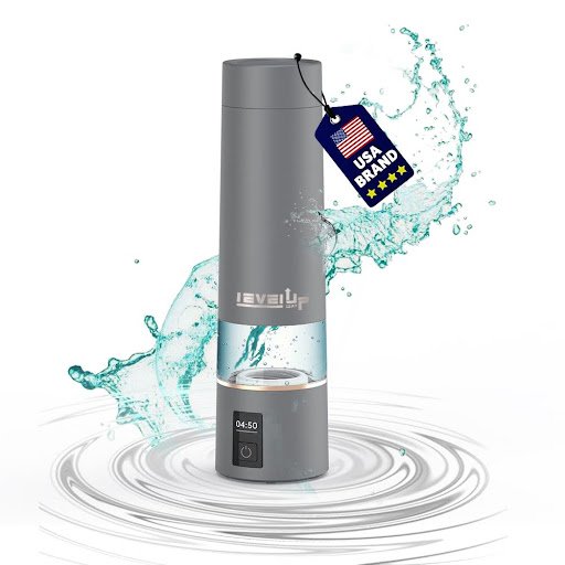
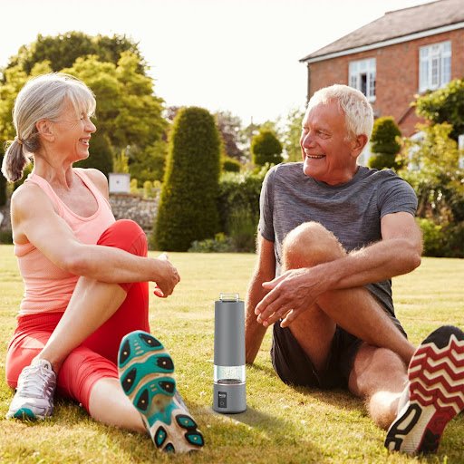
Dynamic (Water Splash)

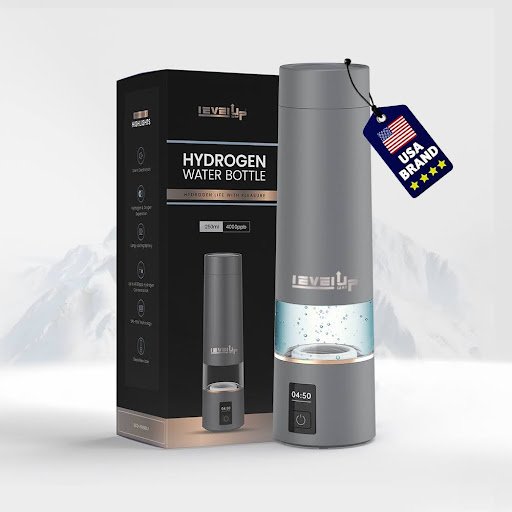
Contextual (With Box)
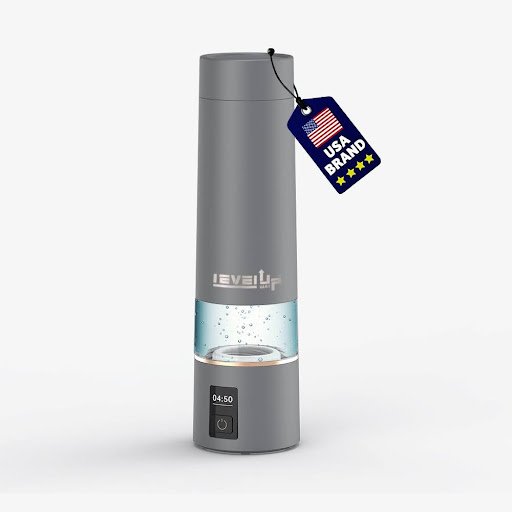
Simple (The Winner)

Results & Impact

Why Black theme?

I analyzed the top 5 competing listings. And what i saw is all competitors amazon listing has a white background and I need to make this product memorable so I  used a consistent dark, glossy background to give the product a sleek and premium look and this idea amazingly worked.

The lifestyle images:

Client Feedback

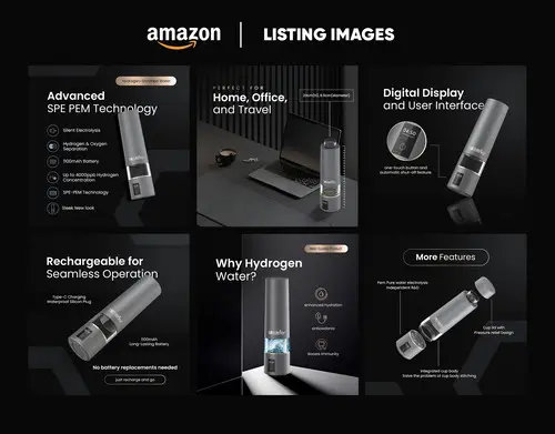
Working with Waleed completely transformed our Amazon presence. The new visuals positioned our product as premium and dramatically improved customer trust.
Joan Paolo
Director of sales

Final Deliverables

Hi, I'm waleed - Lets Collaborate

This project demonstrates how strategic, conversion-focused Amazon design can transform not just visuals, but the entire revenue potential of a product.